
Guide
4 TOF Ad and Landing Page Combinations for Nutrition Brands
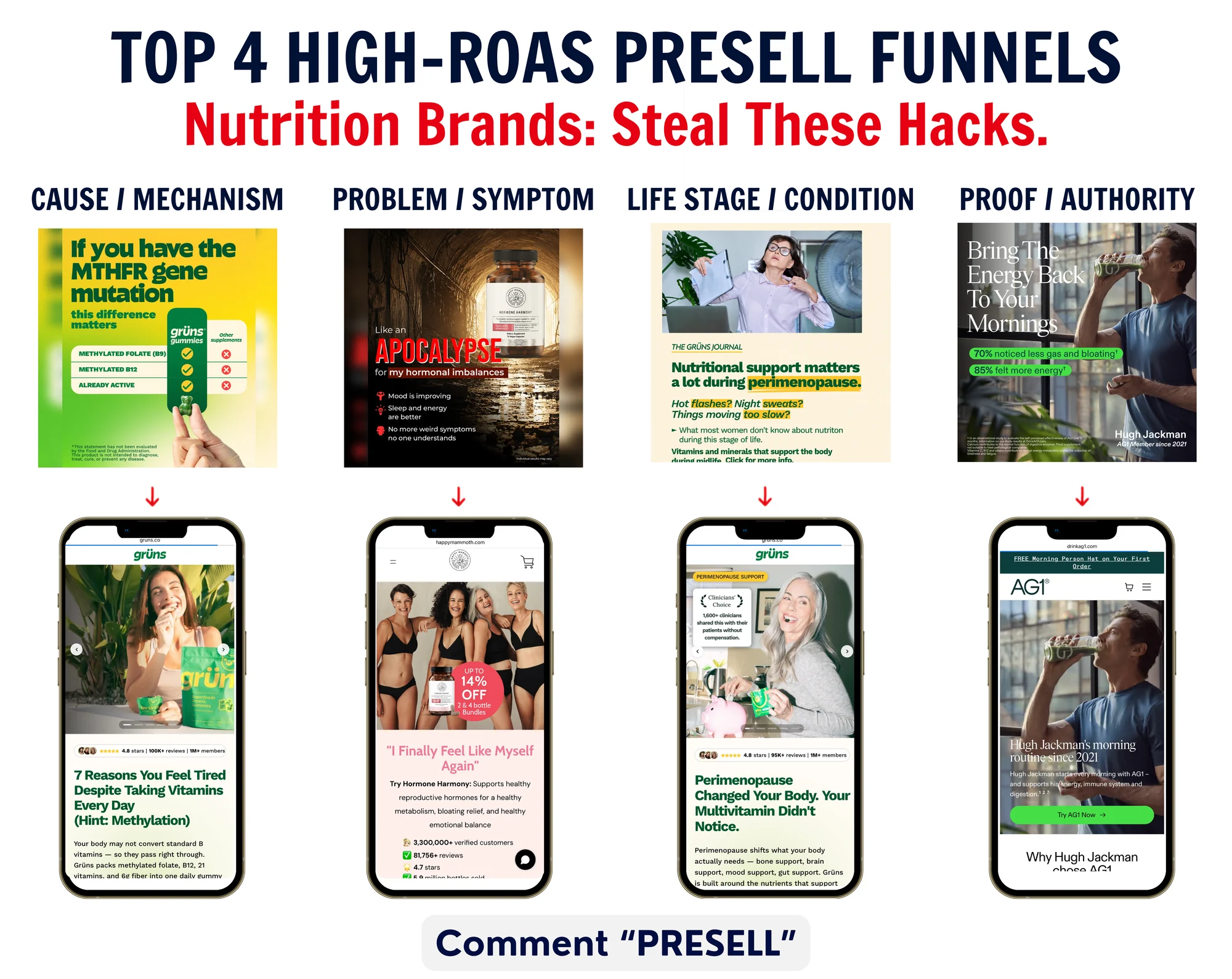
After analysing 3,000+ ads across health and nutrition brands like AG1, Grüns, Happy Mammoth and Nutrafol, I kept seeing the same four TOF approaches.
That makes sense when you look at how people actually buy health and nutrition products. A cold visitor is not always searching for a supplement. They might only know that their hair is thinning. They might be on GLP-1 medication and dealing with a problem they did not have before. They might feel tired, have gut issues, be going through a particular life stage, or simply be trying to improve some part of their health.
Some people want to understand the cause of a problem. Some are looking for possible solutions. Some want the mechanism explained properly. Others already understand the product but need more trust or reassurance from someone whose experience feels relevant, such as a doctor, nutrition professional, athlete or celebrity.
That is why I do not think the job of a TOF ad is only to sell the product. Its first job is to give that person a reason to care and click. The landing page then needs to continue the same reason.
If someone clicks because they are worried about hair thinning, dropping them onto a generic multivitamin PDP asks them to make the jump themselves: hair thinning → this gummy is the product I need.
A presell stays with the problem, explains why the product is relevant, answers the questions that come up, builds belief, and then moves towards the product.
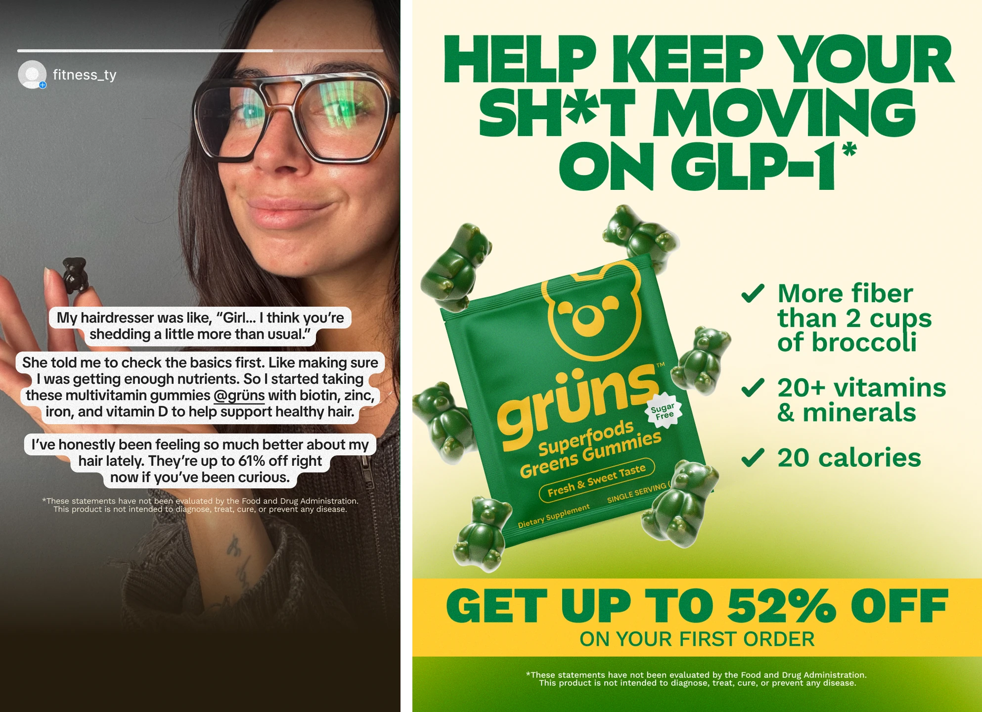
These two Grüns ads show different reasons to enter a funnel. One starts with women’s hair thinning. The other uses gut support for people taking GLP-1 medication as its reason to care. Both advertise the same gummies, but they start with different concerns.
Within a brand, the product can stay the same while the reason for entering the funnel changes.
The basic job of the presell is:
Give someone a reason to click → continue that exact argument → educate and build belief → then sell the product.
Across the health and nutrition ads I mapped, four TOF approaches kept showing up.
Each landing-page preview shows roughly eight mobile screens. The analysis covers the complete page.
Ad type: Problem-specific comparison ad
Landing page type: Mechanism explainer and problem-solution presell
For: People who feel their current vitamins are not working as expected, especially those already aware of MTHFR or methylation
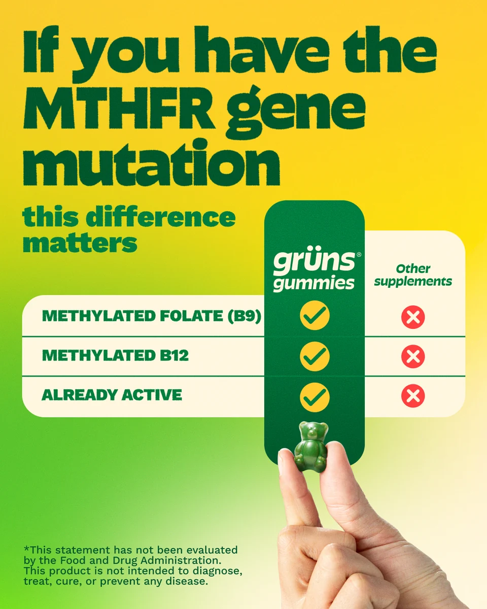
The Grüns ad is direct: Grüns versus regular supplements. It argues that people with an MTHFR gene variant may process certain nutrients differently, then presents Grüns’ methylated folate, methylated B12 and active nutrient forms as the better-fit option.
The landing page continues that argument with the title “7 Reasons You Feel Tired Despite Taking Vitamins Every Day (Hint: Methylation)”. It does not make the reader start again after the click. It stays with tiredness and methylation, explains why Grüns says regular vitamins may not feel effective for everyone, and then moves into benefits, proof, reviews and the product.
What I like about this combination is the continuity. The ad creates a specific question: could the form of the nutrients be the reason my vitamins do not seem to work? The page is built to answer that exact question.

Ad type: Problem-specific, symptom-led ad
Landing page type: Symptom-to-solution presell and product page
For: Women who relate to symptoms associated in the creative with hormonal imbalance, including mood changes, poor sleep, low energy and bloating
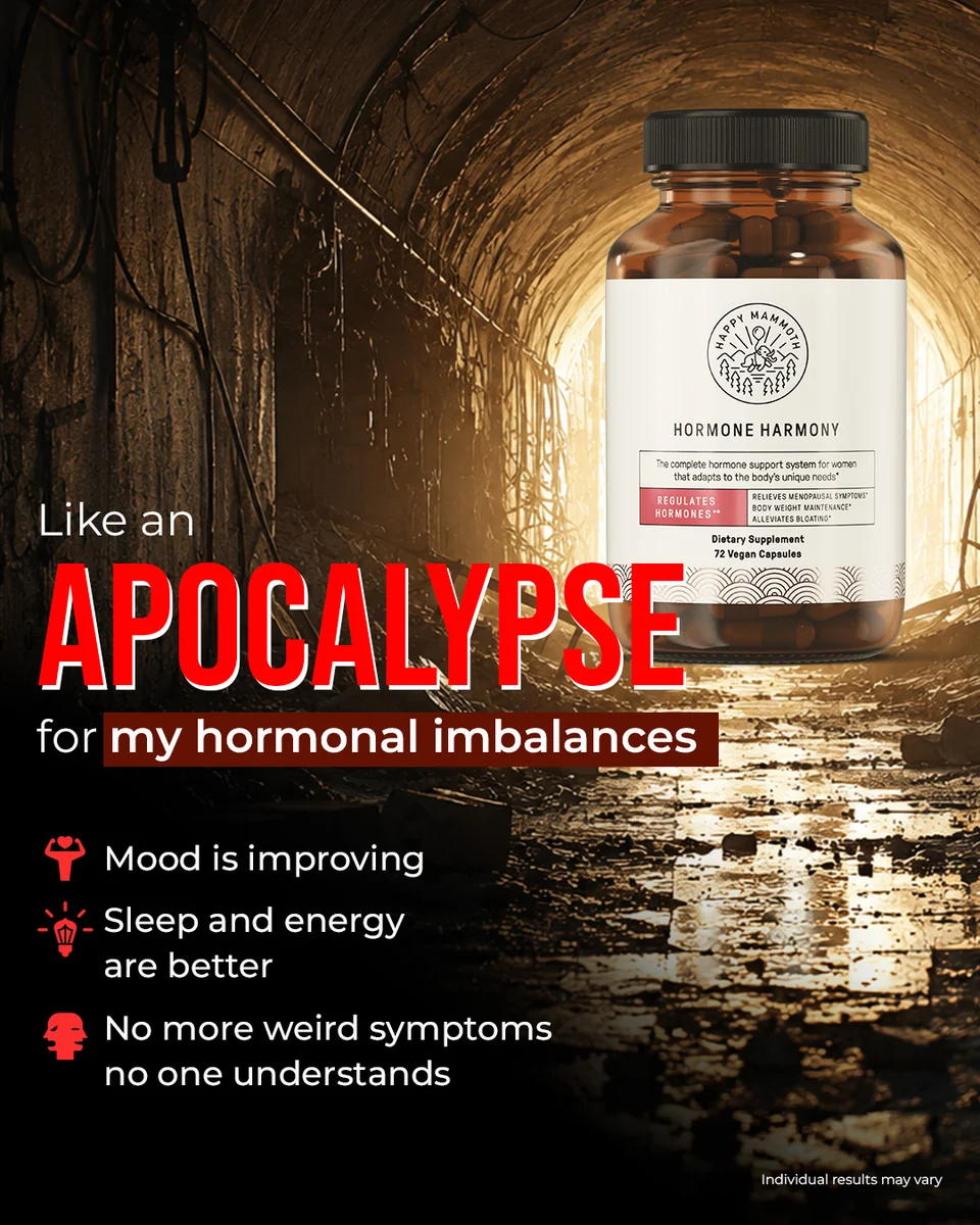
Happy Mammoth’s ad opens with dramatic, memorable language: “Like an APOCALYPSE for my hormonal imbalances”. It makes the problem feel immediate and uses familiar symptoms to help the right person recognise herself in the message.
The landing page continues with “I Finally Feel Like Myself Again”. From there, the page presents Hormone Harmony around hormones, bloating, mood, sleep and energy, while adding reviews, ingredients, expert trust and guarantees before moving towards the product.
The strength of this pair is not a complicated mechanism. It is recognition. The ad says, in effect, “this is the problem you are dealing with,” and the landing page keeps speaking to the same lived experience.

Ad type: Problem and life-stage explainer
Landing page type: Dedicated life-stage explainer and problem-solution presell
For: Women going through perimenopause, especially around age 40 and above
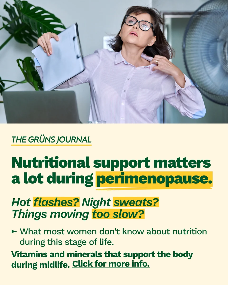
This Grüns ad begins with a life stage: “Nutritional support matters a lot during perimenopause.” It then asks, “Hot flashes? Night sweats? Things moving too slow?” Those are specific concerns that give the reader a reason to pay attention.
The landing page stays inside that same context: “Perimenopause Changed Your Body. Your Multivitamin Didn't Notice.” It explains why Grüns says nutritional needs can change during perimenopause, then connects the product to digestion, energy, brain health, bones and hot flashes.
That makes the education feel relevant. The visitor is not asked to care about a long list of benefits in the abstract. Each benefit is introduced through the life stage that gave her a reason to click.

Ad type: Celebrity and authority-led benefit ad
Landing page type: Celebrity-led authority and benefit explainer page
For: People who already understand the category but want more trust or reassurance before trying AG1
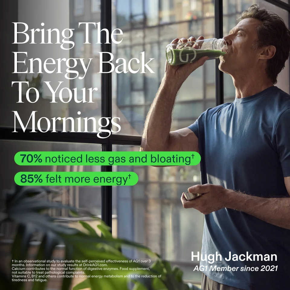
The AG1 creative uses Hugh Jackman as the main trust point. It names him as an “AG1 Member since 2021” and presents AG1 as part of his morning routine. The creative also says that 70% noticed less gas and bloating and 85% felt more energy. Its footnote attributes those figures to an observational study of AG1's self-perceived effectiveness over three months.
The landing page continues the Hugh Jackman angle by explaining why he uses AG1 and what he uses it for. It then brings in benefits, ingredients, testing and other trust points before the CTA “Start Your Day the Hugh Jackman Way”.
This is a different kind of entry point. The ad does not lead with a new mechanism or a symptom. It leads with a familiar person and gives the visitor a reason to trust the product enough to keep reading.

These four approaches start in different places:
The important part is what happens next. The landing page should not throw away the reason that earned the click. It should continue it, answer the next questions, build belief, and make the move towards the product feel natural.
That is the pattern I kept seeing across the 3,000+ ads I mapped: different reasons to click, with the same argument carried from the ad into the landing page.